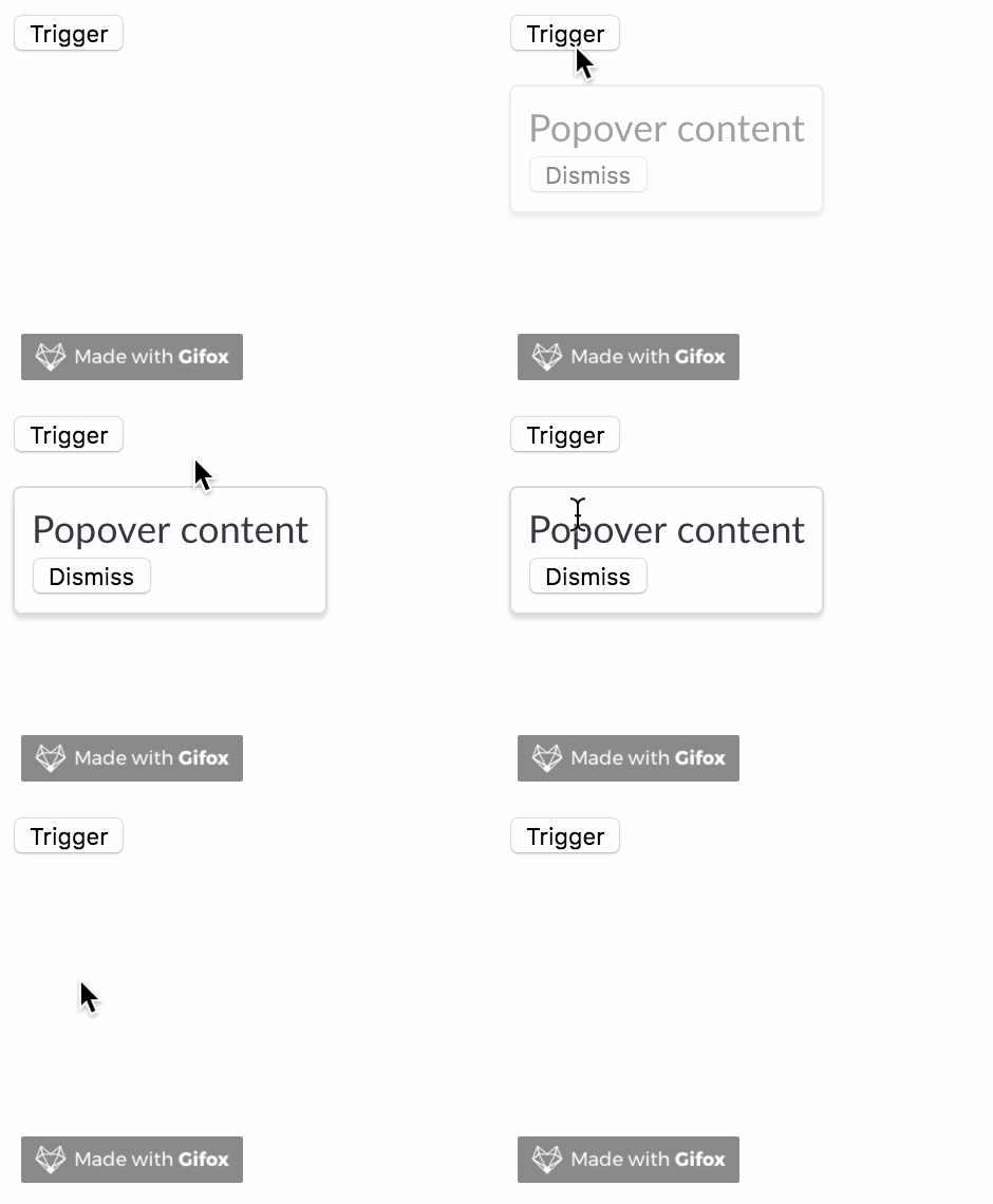
Farmblocks popover
A customisable popover component

Installation
npm install @crave/farmblocks-popover
Usage
<Popover
  trigger={<button>Trigger</button>}
  content={dismiss => (
    <div>
      <Text>Popover content</Text>
      <button onClick={dismiss}>Dismiss</button>
    </div>
  )}
/>
API
| Property | Description | Type | Required | Default |
|---|
| trigger | A node that will be popover's trigger. Can also be a function that receives isVisible state and returns a node | node or func => node | Yes | |
| content | A render function with the contents to be displayed on the popover | func => node | Yes | |
| tooltipProps | Props to be passed to Tooltip component | object | | |
| triggerWidth | A CSS value for the trigger container width | string | | auto |
| onOpen | called when the popover opens | func | | |
| onBeforeOpen | called before the popover opens. If the given function returns a Promise, the popover will wait until it resolve to open | func | | |
| onClose | called when the popover closes | func | | |
| disabled | prevents the popover to open when the trigger is clicked. | bool | | false |
License
MIT


